Three hundred years ago, in Johann Sebastian Bach’s day, there were no typewriters or computers, not even fountain pens or ballpoint pens. Instead, people wrote with a goose quill and ink, and sometimes also in pencil.
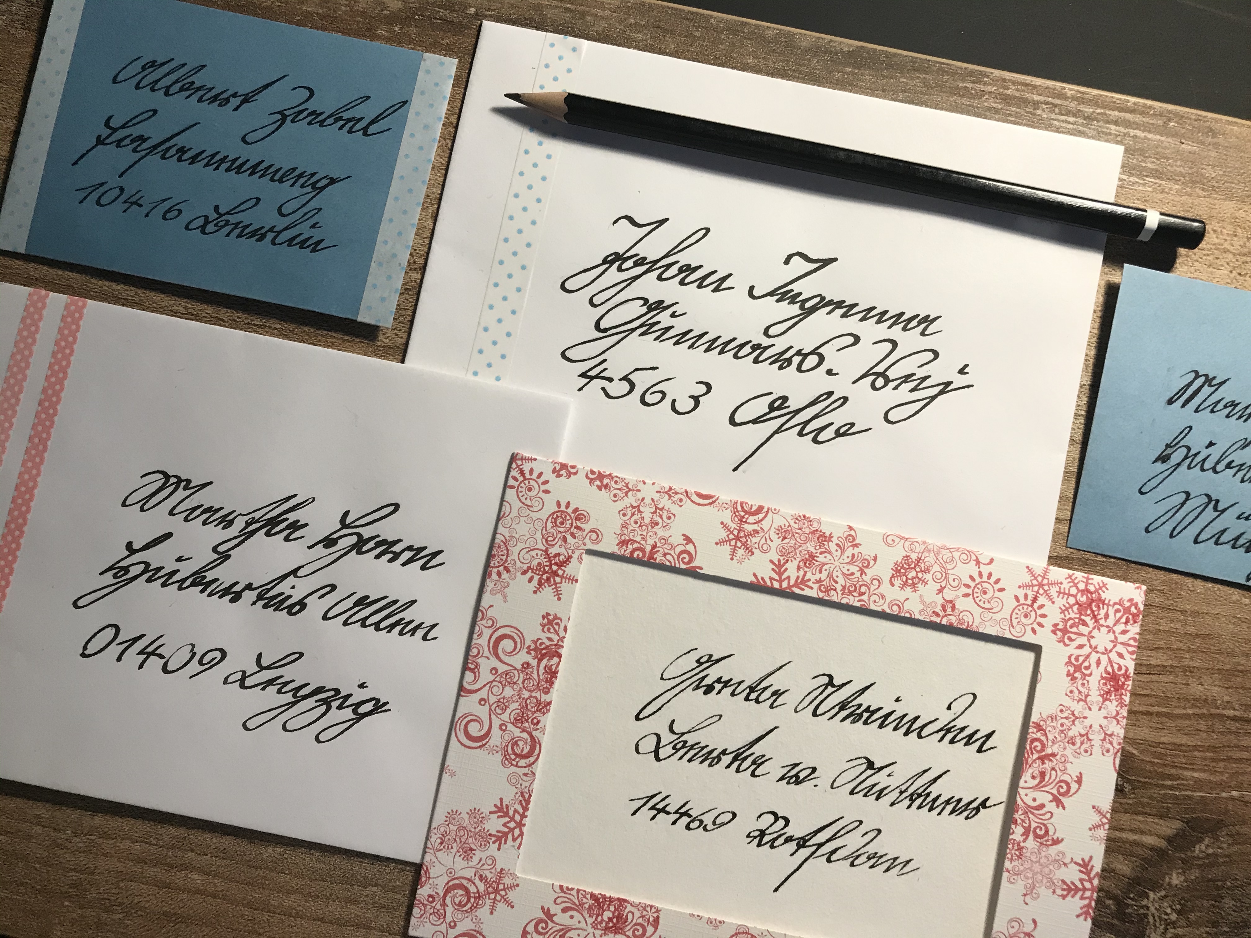
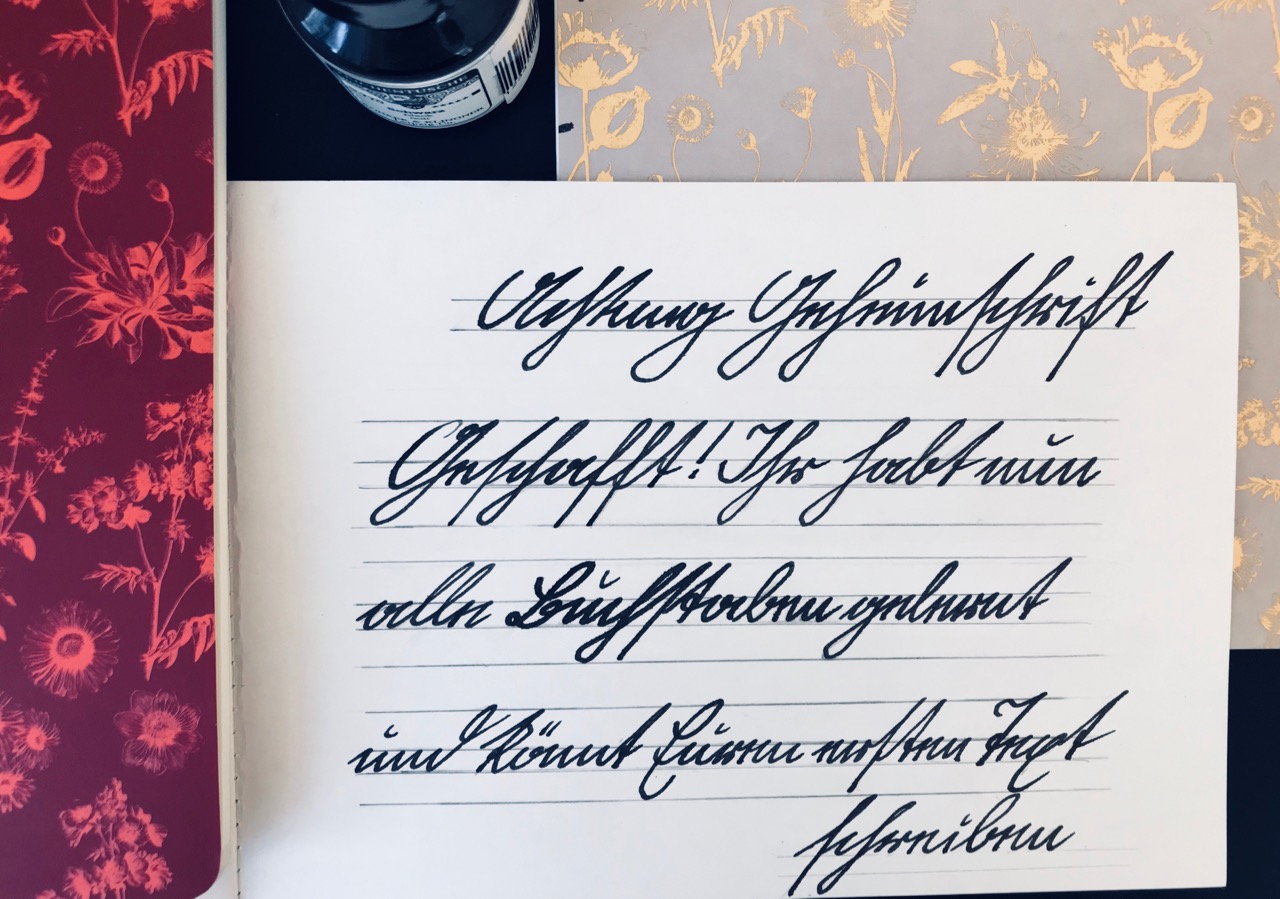
Until the invention of the typewriter, people had to write everything by hand. Although heaps of letters and diaries have survived from times gone by, these days the handwriting that people used until the 20th century is unknown to most of us. But perhaps your grandparents can still read and even write the German script known as ‘Kurrent’. The name Kurrent comes from the Latin verb ‘currere’, which means to run – in other words, ‘running script’. In fact, the letters of this script really do seem to be running away to the right!
Unlike the round, Latin handwriting that you learn at school today, Kurrent features several pointed letters. Nevertheless, it also contains many curves. Kurrent was typically written using a quill or dip pen, both of which are well suited for its rising and falling lines.
Sütterlin is a variant of Kurrent which was introduced for teaching in schools over a hundred years ago, but was abolished in 1941. Over time, German Kurrent script (including Sütterlin) came to be used less and less. Historians and other scholars still need to be familiar with Kurrent in order to read handwritten documents from the past. But since only very few people know how to read Kurrent, you could use it as a form of secret writing!
A Kurrent writing course is shown below in the picture gallery. Complete the 30-day challenge – and after a month, you’ll be able to write like Johann Sebastian Bach!
Here are a few things to bear in mind:
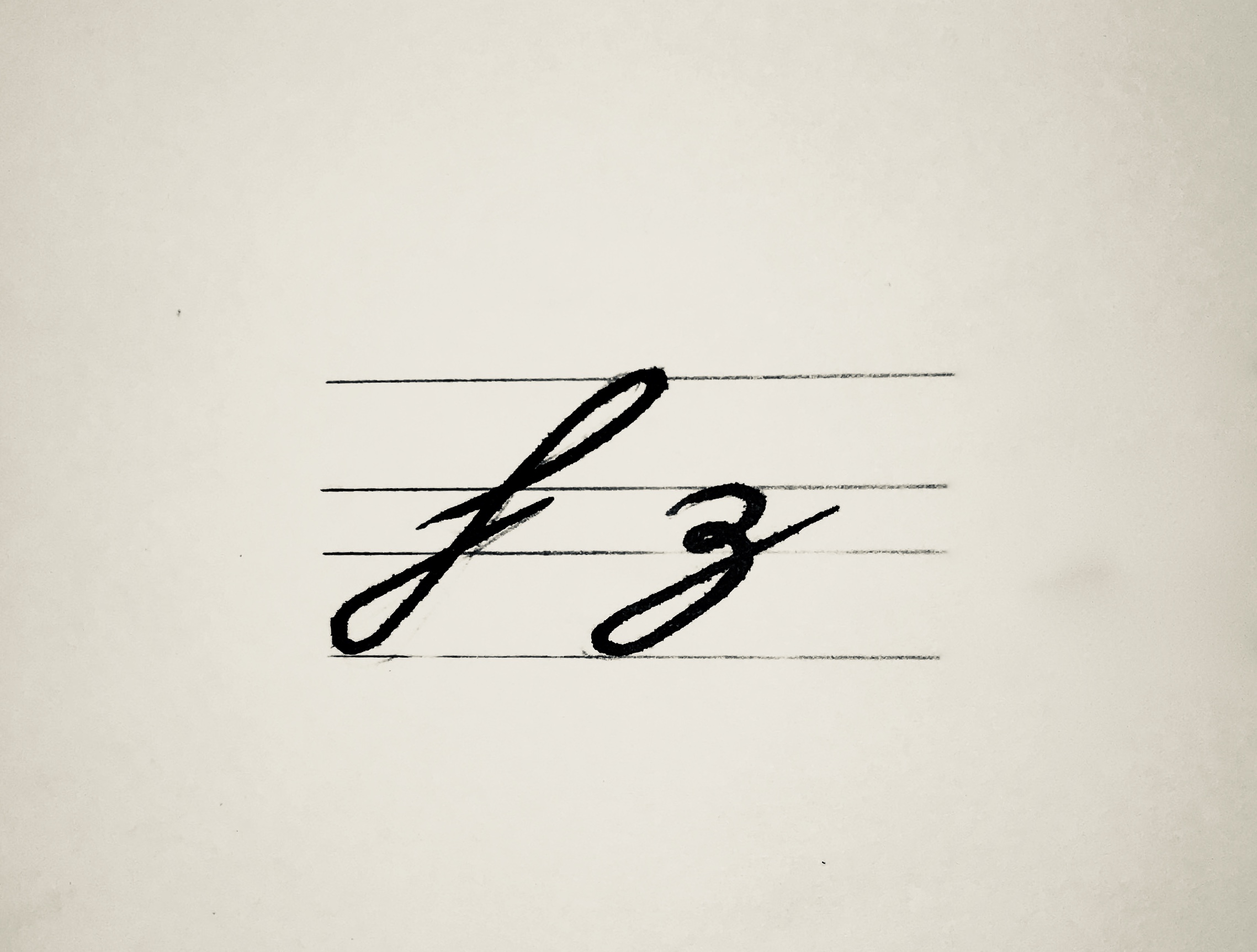
German Kurrent slopes to the right (think of the hands on a clock showing five past seven). The ascenders (letters reaching above the level of an x) have loops. Many letters are written with a single pen stroke. The letters h and z have loops on their lower curves.
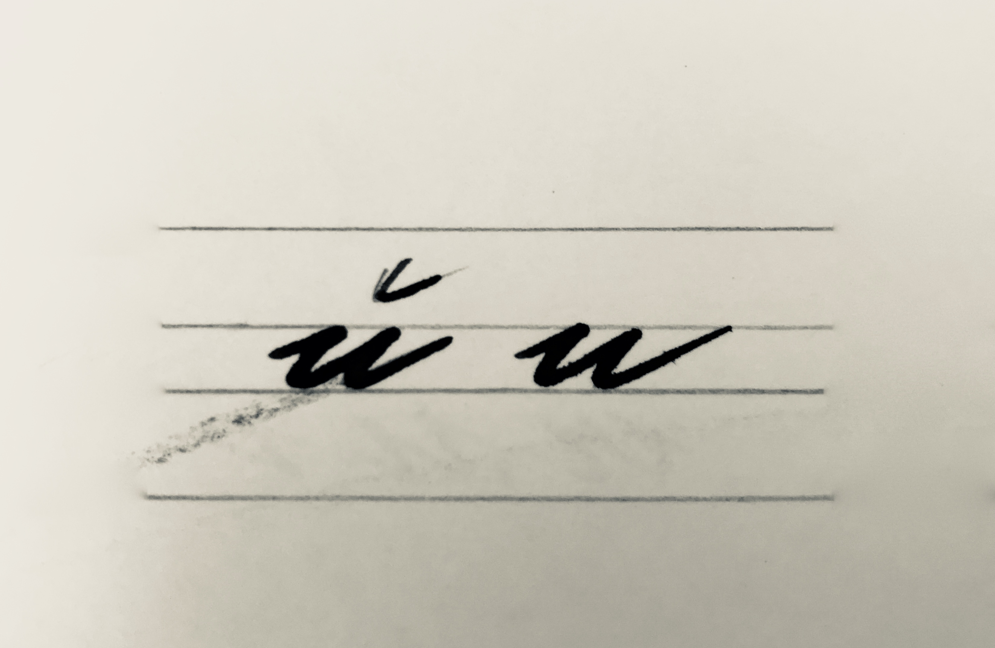
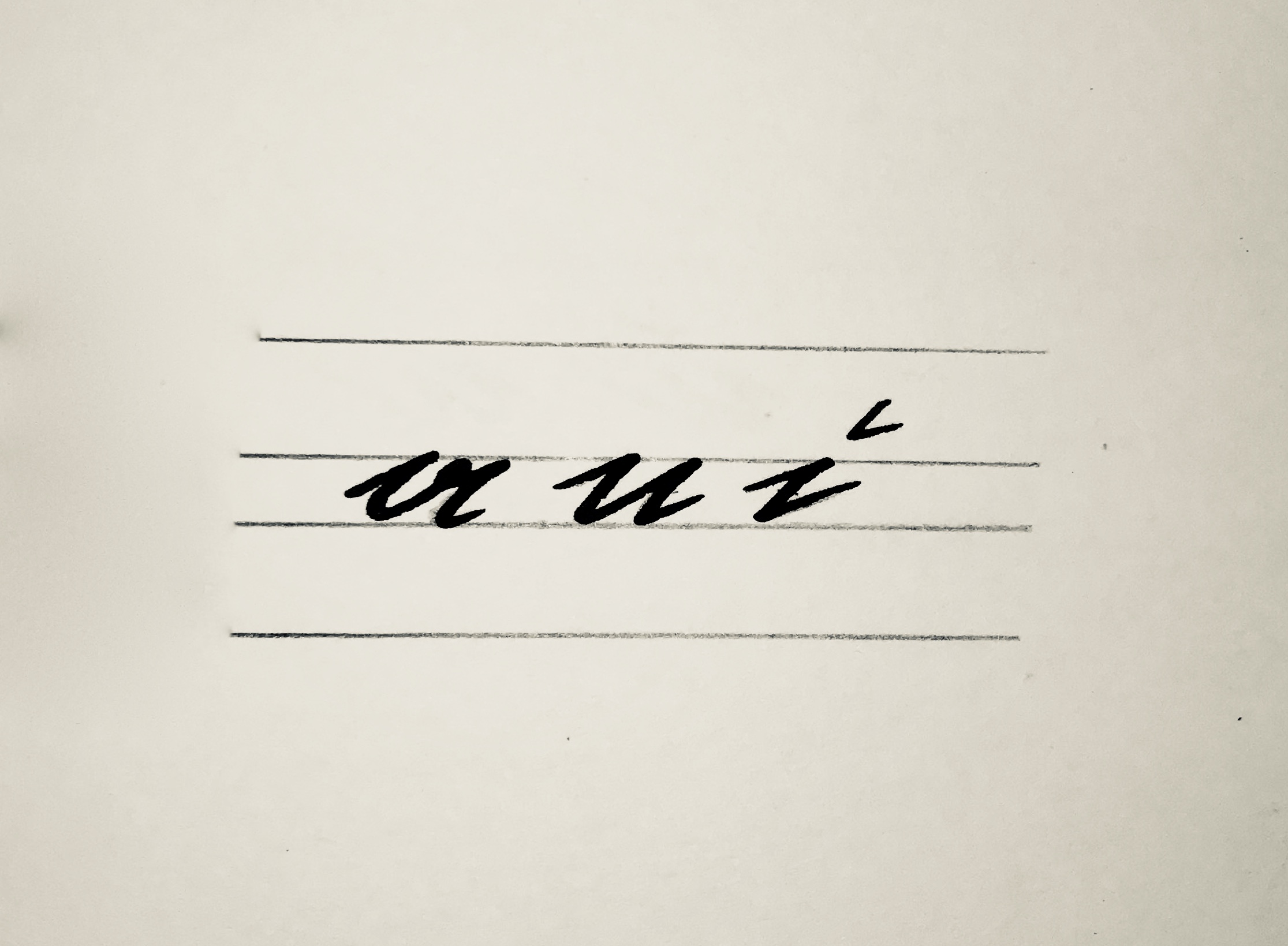
The e has its own shape and looks like our present-day n. Since the letters n and u look so similar, a breve is drawn above the u to distinguish it.
Pay particular attention to the script’s sloping appearance as this is an essential part of Kurrent.
Like in Latin script, the letters in Kurrent have different heights and positions. There are small letters, tall letters, dangly letters, and some letters which are both tall and dangly.
Small letters fit between the baseline and the mean line. Examples include a, n and i.
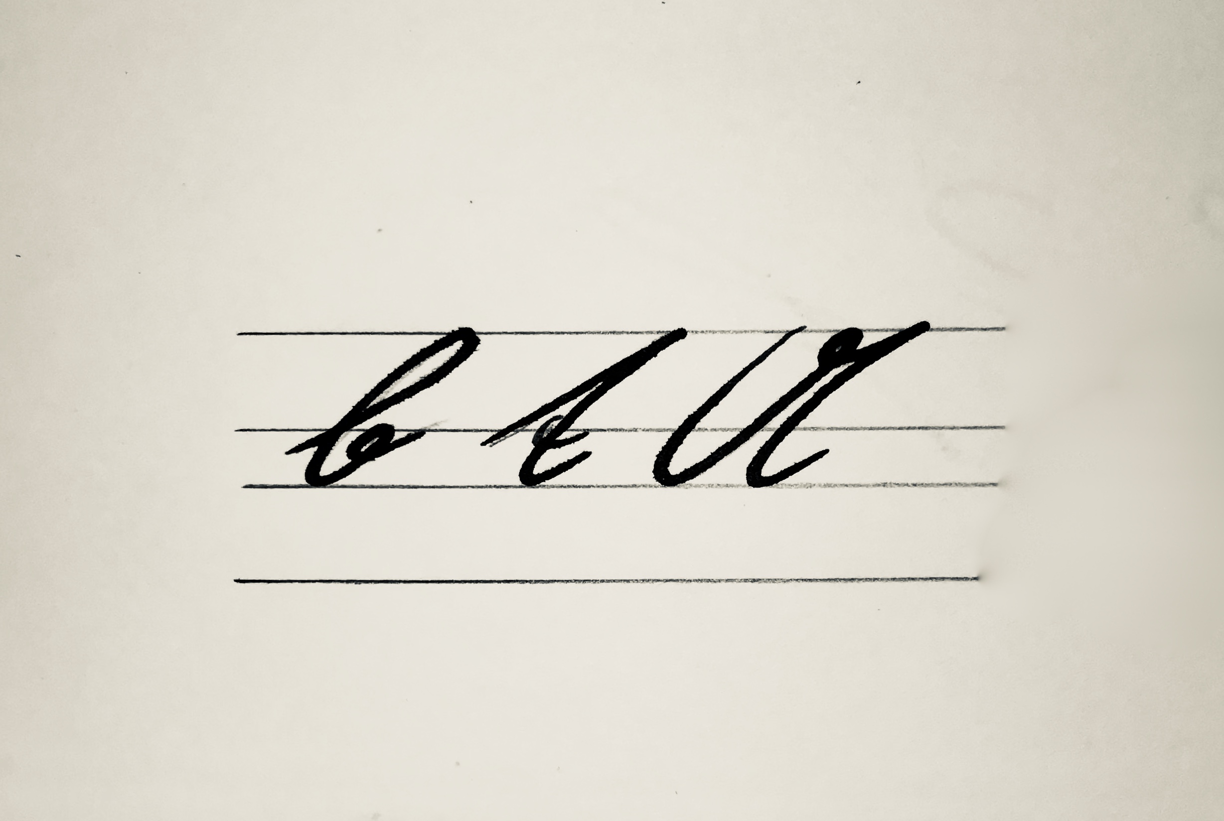
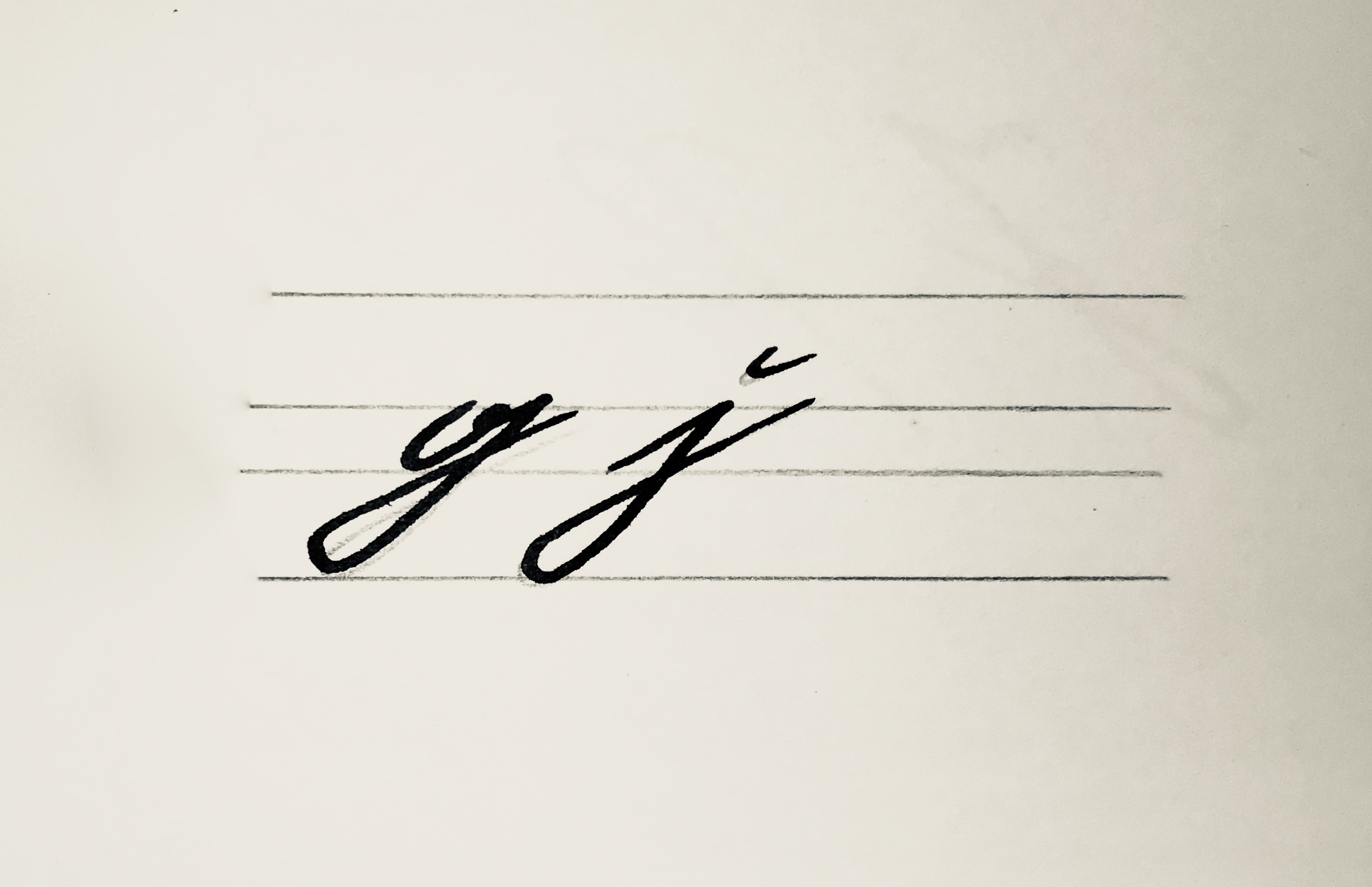
Tall letters are positioned between the baseline and the ascender line like b, t and A, while dangly letters are located between the descender line and the mean line such as g and j.
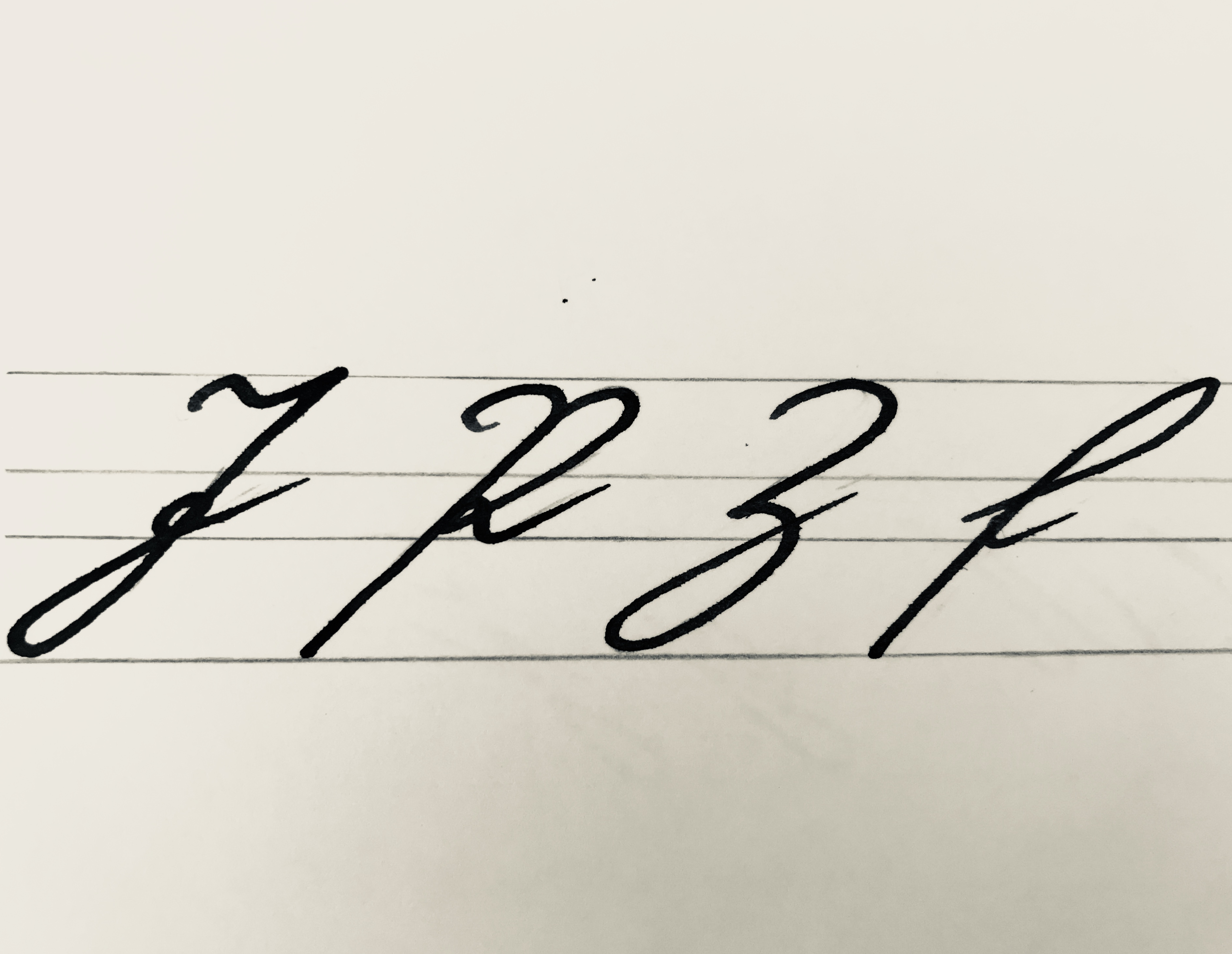
Letters which are both tall and dangly stretch from the descender line up to the ascender line, for example J, P, Z and f.
Our handwriting course doesn’t begin with A and end with Z, but is based around letters with similar characteristics.
Practise two letters each day. Begin with lowercase letters. All lowercase letters start on the baseline.
First of all, practise writing letters. Fill the first two lines with one letter each. After a few days, you can use the third line to write your first words.
It’s best to use a fountain pen or, if you have one, a dip pen. Write on smooth lined paper. There’s a sheet of paper with suitable lines in the right-hand column which you can download and print. You can also download and print the complete alphabet in the right-hand column.
on
Wir benötigen Ihre Zustimmung!
Wir benutzen Cookies, um unseren Datenverkehr zu analysieren. Ihre Zustimmung kann jederzeit unter Datenschutz widerrufen werden.